Free Help To Keep Your Home - Brand Identity & Logo Design
-
Client
Confidential
-
Category
Logo & Branding Design
Free Help To Keep Your Home - Brand Identity & Logo Design
Project Overview:
A comprehensive brand identity design for "Free Help To Keep Your Home," a community-focused real estate initiative that embodies the spirit of paying it forward and helping homeowners maintain their most valuable asset.
The Challenge:
Create a memorable and trustworthy brand identity for a real estate service that emphasizes community support, accessibility, and the philosophy of giving back. The brand needed to communicate warmth, reliability, and a genuine commitment to helping people protect their homes.
Design Solution:
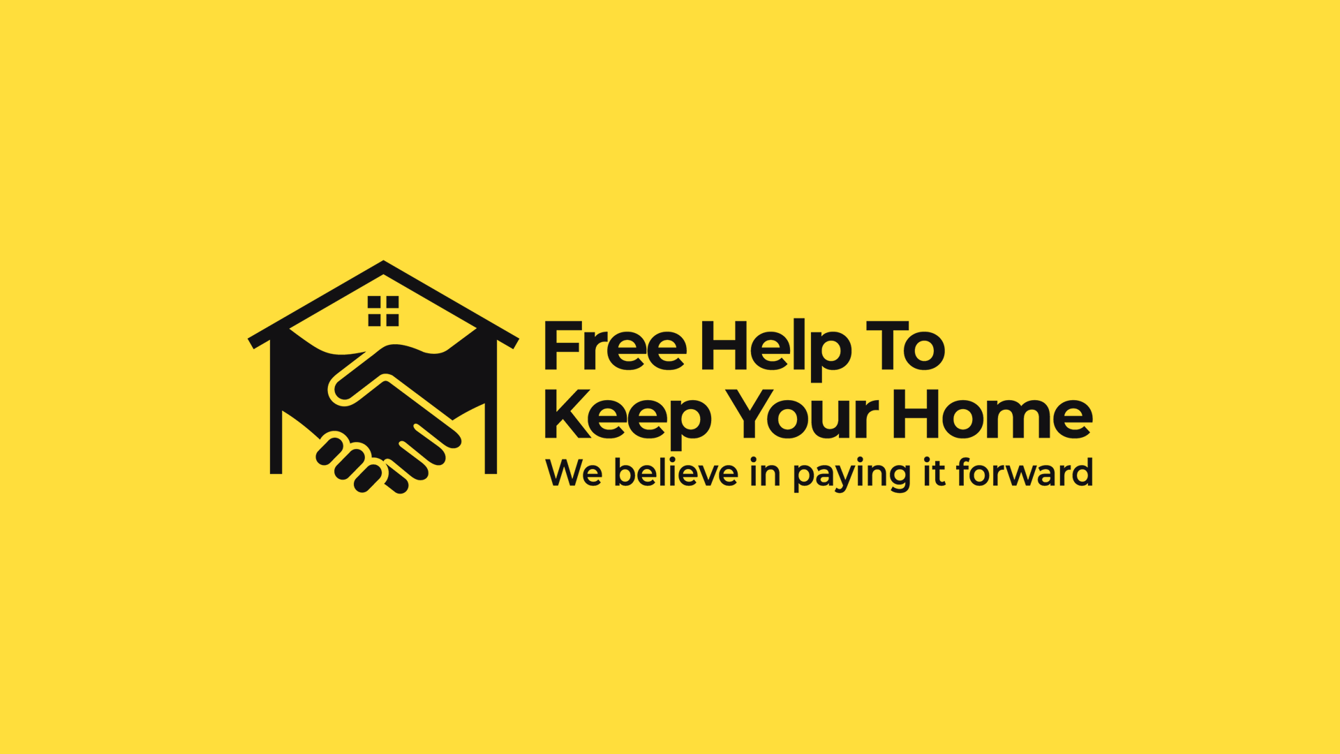
Logo Concept The logo features a unique combination of two powerful symbols: House silhouette: Representing home, security, and shelter Handshake: Symbolizing trust, partnership, and community support
This clever integration creates a visual narrative that perfectly captures the brand's mission - bringing people together to support homeownership.
 Color Palette
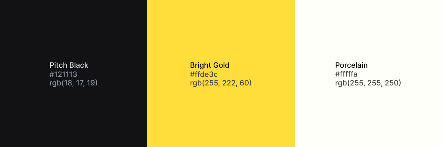
Primary Color: Bright Gold (#ffde3c) Conveys optimism, hope, and positivity Creates high visibility and memorability Represents warmth and welcoming energy
Secondary Color: Pitch Black (#121113)
Provides strong contrast and readability
Adds professionalism and authority
Ensures the design works across all applications
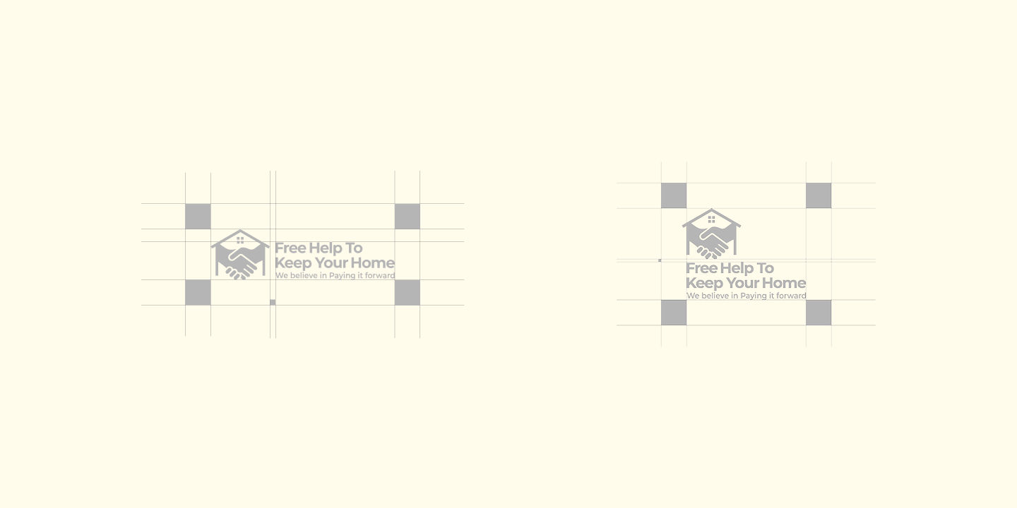
 Typography
Bold, modern sans-serif typography ensures: Maximum readability across all platforms Contemporary and approachable feel Strong visual hierarchy between headline and tagline
Brand Message
Headline: "Free Help To Keep Your Home" Clear, direct communication of the service SEO-friendly keywords for real estate assistance Action-oriented language
Tagline: "We believe in paying it forward" Establishes brand values and philosophy Creates emotional connection with audience Reinforces community-focused mission
Design Applications
This versatile brand identity works seamlessly across: Digital platforms (website, social media) Print materials (business cards, flyers, signage) Marketing collateral Promotional items Vehicle wraps and outdoor advertising
Brand Impact
The design successfully communicates: Trust & Reliability: Through the handshake symbolism Home & Security: Via the house icon Positivity & Hope: With the vibrant yellow background Community Values: Through the "paying it forward" message Accessibility: Clear, straightforward messaging
Project Deliverables
Primary logo design Color variations (full color, black, white) Brand style guide Typography specifications Color palette documentation Application mockups File formats: AI, EPS, PNG, SVG, PDF
Industry
Real Estate | Community Services | Non-Profit Initiatives
Services Provided
Brand Strategy Logo Design Brand Messaging Style Guide Creation
Results
The final brand identity successfully positions "Free Help To Keep Your Home" as an approachable, trustworthy, and community-focused organization. The memorable logo and cohesive visual system create strong brand recognition while effectively communicating the organization's mission to help homeowners in need.
Why This Brand Identity Works
Instant Recognition: The unique house-handshake combination creates a distinctive mark that's memorable and meaningful. Emotional Connection: The design taps into universal desires for home security and community support, creating immediate emotional resonance. Versatile Application: The bold, simple design scales perfectly from business cards to billboards, maintaining impact at any size. Clear Communication: The brand doesn't rely on clever wordplay or obscure concepts - it clearly states what it does and why. SEO Optimization: The brand name includes key search terms like "help," "home," and "keep," improving discoverability for people seeking housing assistance.
Looking for Professional Brand Identity Design?
If you need a memorable logo and cohesive brand identity that connects with your target audience and stands out in your industry, let's collaborate on your next project. I specialize in creating strategic, visually compelling brand identities for real estate professionals, community organizations, and purpose-driven businesses.
Contact me today to discuss your branding needs.