Eatery Point – Custom Mobile App Icon & Restaurant Logo Mark
-
Client
Confidential
-
Category
UI/UX & Web Design
-
Date
August 14, 2025
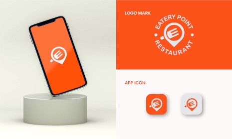
This project showcases a custom-designed mobile app icon and logo mark for Eatery Point, crafted to maintain brand consistency across both digital and physical platforms. The objective was to create a clean, modern visual identity that works seamlessly in mobile environments while preserving the core restaurant branding.
Key elements of the design: • Logo Mark – Circular emblem integrating a location pin and the brand’s initial, symbolizing food discovery and local dining. • App Icon Design – Simplified yet instantly recognizable icon optimized for various screen sizes and operating systems. • Color Palette – Vibrant orange primary color paired with white for high contrast and strong visibility on any background. • Scalable Vector Format – Ensuring sharpness and clarity across mobile apps, websites, menus, and signage. • Consistency Across Touchpoints – Designed to align perfectly with Eatery Point’s existing branding, menus, packaging, and uniforms.
This project reflects ColorPark’s expertise in creating cross-platform brand identities that are not only visually appealing but also functional, scalable, and instantly recognizable in a competitive digital marketplace.