Introduction
We’ve all heard the mantra: “Don’t judge a book by its cover.” But when it comes to websites and digital products, users absolutely do.
In a world of endless options, people form instant opinions based on what they see — sometimes in milliseconds. And while UX (user experience) design is often thought of as function-first — how something works — the look and feel still matters just as much. If your product isn’t visually appealing, users may never stick around long enough to discover how well it works.
So here’s the big question: Does aesthetics still matter in UX design? Spoiler: it absolutely does — and today, it matters more than ever.
In this post, we’ll explore the powerful intersection of beauty and usability. You’ll learn why great UX isn't just about wireframes and flows — it's about visual storytelling, trust-building, and creating emotional engagement through design.
Let’s dive in.
What Is UX Design Really About?
UX design is more than just functional layouts. It’s about crafting experiences that are intuitive, enjoyable, and frictionless.
But here's the truth: great UX starts with trust — and trust often begins with aesthetics.
When users land on your site or app, visual design is the first impression. Before they click, scroll, or interact, they’re subconsciously deciding if this feels trustworthy, credible, or relevant.
Function answers the "how". Aesthetics answer the "why".
The Psychology of First Impressions
- Users form opinions in just 50 milliseconds.
- Attractive websites are perceived as more usable, trustworthy, and professional.
- Clean, well-designed interfaces are associated with higher value products or services.
A Stanford study even found that 75% of users judge a company’s credibility based on its website design.
So if your product looks outdated, cluttered, or unprofessional — you’re likely losing users before they ever engage.
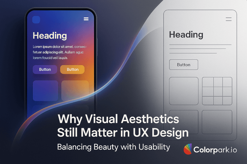
Beauty Enhances Usability — Not Competes with It
Some UX purists argue that beauty is secondary to usability. But in practice, beauty can amplify usability.
Example: Clean Visual Hierarchy
- A beautifully designed interface with proper spacing, color contrast, and typography makes navigation easier.
- Clear visual cues (buttons, icons, animations) guide users seamlessly.
Example: Emotional Resonance
- Aesthetic design evokes emotion.
- Delightful visuals create a positive emotional memory, improving brand recall and loyalty.
🧠 In short: Beauty isn’t fluff. It’s a functional layer of UX that reduces cognitive load and drives engagement.
The Aesthetic-Usability Effect
This is a well-documented UX principle.
“Users often perceive more aesthetically pleasing designs as easier to use — regardless of actual usability.”
This means that even if a product has a learning curve, users will be more forgiving if it looks and feels pleasant.
Aesthetic design improves:
- Tolerance for minor usability issues
- Overall satisfaction
- Trust and emotional connection
This is why products like Apple, Airbnb, and Notion win hearts — not just for functionality but for how they feel to use.
Real-World Examples: Beauty Meets Function
1. Apple.com
- Ultra-minimal, visually polished
- Every pixel guides users to explore effortlessly
- Trust is built instantly — it feels premium
2. Headspace App
- Beautiful, soft illustrations
- Calming color palette aligned with their brand promise
- Supports function: users feel relaxed and focused
3. Stripe’s Developer Dashboard
- Clean data presentation
- Intuitive navigation + modern interface
- Form meets function in a technical, high-trust environment
Common Misconceptions: Debunked
❌ “Aesthetics are just decoration”
→ Truth: They influence perception, comprehension, and decision-making.
❌ “You have to choose between pretty and usable”
→ Truth: With thoughtful design, you can have both. In fact, they strengthen each other.
❌ “It’s not worth the budget”
→ Truth: A well-designed UX/UI increases conversion, retention, and perceived brand value.
How to Balance Aesthetics & Function in UX Design
Here’s a strategy-driven approach:
1. Start with the User Flow
- Map out user goals and actions.
- Design layouts that reduce friction and guide them naturally.
2. Define Your Visual Identity
- Use consistent branding: colors, fonts, icons.
- Keep it modern, accessible, and device-agnostic.
3. Design for Emotional Triggers
- Use images, micro-animations, and visuals that spark joy or trust.
- Match the emotion to your product's purpose (playful vs. serious, luxury vs. functional).
4. Simplify, Then Polish
- Remove clutter first.
- Then refine visual hierarchy, alignments, and spacing for aesthetic harmony.
5. Test Real Users
- Gather feedback on emotional response and task ease.
- A/B test visual versions — measure impact on trust, engagement, and conversions.
Beauty Builds Trust, and Trust Drives Action
In eCommerce, SaaS, apps, and marketing — trust is everything.
And beauty (when done right) is your silent trust builder.
If your interface looks professional, users are more likely to:
- Enter personal data
- Make purchases
- Engage longer
- Recommend it to others
This isn’t just design theory — this is business ROI.
The Bottom Line
UX isn’t just about buttons and flows. It’s about how a user feels — from the first glance to the final interaction.
In 2025 and beyond, aesthetics will remain a strategic advantage. Not because they’re pretty — but because they work.
Design that looks good feels better, performs better, and converts better. The true power lies in mastering the balance between beauty and usability.
6. Quick Takeaways
- Users judge your product in milliseconds — looks matter.
- Aesthetic design increases trust, usability, and emotional connection.
- The Aesthetic-Usability Effect makes people forgive small flaws if it looks right.
- Functionality should be wrapped in clean, intentional, and branded visuals.
- Beauty is not optional — it's a competitive edge in modern UX.
7. Call to Action (CTA)
Looking to design an experience that’s both beautiful and intuitive?
👉 Let ColorPark.io bring your UX vision to life. We blend strategy, creativity, and user insight to craft high-performing, trust-building digital experiences — from landing pages to full product interfaces.
Let’s build something users love.
8. FAQ Section
Q: Why is visual design important in UX?
A: Because it forms the first impression. Users instantly judge credibility, trustworthiness, and usability based on visual aesthetics.
Q: Can good visuals improve poor usability?
A: To an extent. The Aesthetic-Usability Effect shows users are more forgiving of minor issues if a product looks appealing — but it's not a substitute for good UX.
Q: How can I test if my UX is visually effective?
A: Use A/B testing, heatmaps, user interviews, and conversion tracking to see how different visual approaches affect behavior.
Q: Should I prioritize function or form?
A: Ideally, both. Start with user-centered functionality, then elevate the experience with meaningful, consistent, and engaging visual design.