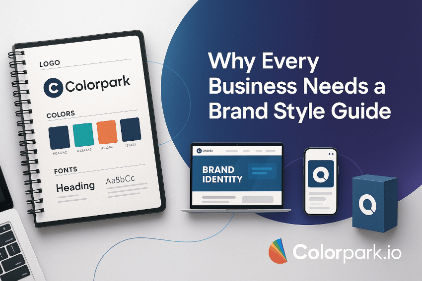

Introduction
Imagine this: You’re scrolling through Instagram, and you instantly recognize a post from Apple without even seeing the logo. The clean lines, muted tones, and crisp typography scream Apple before you even double-check the username.
That’s the power of a brand style guide.
Brands that feel consistent across every touchpoint—whether it’s a website, email, ad, or packaging—don’t just look polished; they build trust and recognition. Without consistency, even the most brilliant business ideas can look scattered and forgettable.
In this post, we’ll break down the key elements of a brand style guide—what goes into it, why it matters, and how you can create one that ensures your brand always shows up with confidence, clarity, and cohesion.
By the end, you’ll have a blueprint to not only craft your own style guide but also understand how to use it as a growth tool that strengthens your brand identity over time.
Main Body
What Is a Brand Style Guide and Why Does It Matter?
A brand style guide (also called a brand book or brand manual) is a documented set of rules that define how your brand should look, sound, and feel across every platform.
Think of it as your brand’s “rulebook.” Just like a recipe ensures the same cake tastes the same every time, a style guide ensures that no matter who designs your social posts, builds your website, or creates a brochure, the end result is unmistakably you.
Without one, you risk sending mixed signals:
- One designer uses navy blue, another uses sky blue.
- Your Instagram feels playful, but your website sounds formal.
- A marketing campaign looks great—but it doesn’t look like your brand.
That inconsistency erodes trust and confuses customers. And in today’s crowded marketplace, confusion is the enemy of loyalty.
The Core Elements of a Brand Style Guide
Let’s break down the must-have components that make a style guide effective.
1. Brand Story & Mission
Before visuals, your brand needs a foundation. This section captures the “why” behind your brand.
- Mission statement: Why do you exist? (e.g., Patagonia: “We’re in business to save our home planet.”)
- Vision: Where are you headed long-term?
- Core values: The principles guiding every decision.
💡 Tip: Keep it short and inspiring. This isn’t an internal business report—it’s the spark that should motivate anyone working on your brand.
2. Logo Usage
Your logo is the most visible part of your brand. But if it’s misused—stretched, recolored, or squished—it can ruin recognition.
A strong guide should cover:
- Primary logo: The main version
- Secondary/alternate logos: Horizontal, stacked, icon-only versions
- Clear space rules: Minimum spacing to keep it readable
- Wrong usage examples: What NOT to do (e.g., don’t put it on clashing backgrounds, don’t rotate it)
Example: Spotify’s style guide shows exactly how their green circle-and-wave mark should appear in every context.
3. Color Palette
Colors trigger emotion and recognition. Think Coca-Cola red or Tiffany blue.
Your guide should include:
- Primary colors: The main brand colors
- Secondary colors: Supporting tones
- Tertiary/accent colors: Optional highlights
- Codes: HEX, RGB, CMYK, and Pantone values for digital and print consistency
💡 Pro tip: Limit to 3–5 core colors. Too many can dilute recognition.
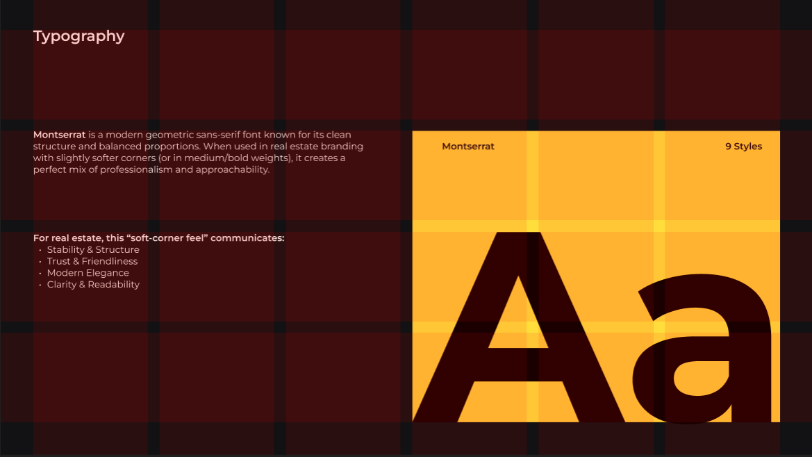
4. Typography
Fonts have personality. Serif fonts feel traditional; sans-serifs look modern; scripts feel playful.
Outline:
- Primary font: Main headline style
- Secondary font: Body copy
- Fallback options: In case brand fonts aren’t available
- Rules for sizes, weights, and hierarchy
Example: Google’s Material Design guidelines clearly explain how to use type scales for consistency across devices.
5. Imagery & Photography Style
Images tell your story faster than words. Your guide should define:
- Photography tone: Bright and bold? Minimalist and muted?
- Subject matter: People, products, lifestyle shots?
- Do’s and Don’ts: Example images to copy vs. avoid
Brands like Airbnb use consistent lifestyle photography—warm, authentic, real people in real places—which reinforces their identity.
6. Iconography & Graphics
If you use icons, patterns, or illustrations, define their style.
- Line thickness, shapes, and sizes
- Consistency rules (flat vs. 3D, filled vs. outlined)
- Where they should or shouldn’t be used
7. Voice & Tone
Words matter as much as visuals. A brand that looks modern but sounds stiff feels off.
Your style guide should outline:
- Voice: Overall personality (e.g., friendly, authoritative, witty)
- Tone: How voice adapts to situations (playful on social, empathetic in support emails)
- Examples: Side-by-side “on-brand” vs. “off-brand” sentences
Example: Mailchimp’s voice guide is famous for its approachable, witty writing style.
8. Applications & Examples
Theory is good, but real-world application cements it. Show:
- Mockups of ads, social posts, and website pages
- Email templates
- Packaging designs
This helps people visualize the style guide in action.
9. Digital Guidelines
In today’s digital-first world, include:
- Web design rules: Buttons, hover states, spacing
- Social media guidelines: Post templates, profile images, story formats
- Accessibility standards: Contrast ratios, alt text usage
10. Brand Governance
Finally, a style guide should explain how to keep it alive.
- Who manages updates?
- Where is the guide stored (PDF, cloud tool, etc.)?
- How do team members or partners get access?
Without governance, even the best guide will collect dust.
Common Mistakes to Avoid
- Overcomplicating it – A 200-page brand book will never get used.
- Being too vague – “Use bright colors” isn’t helpful. Provide exact codes.
- Not updating – As brands evolve, so should the guide.
- Ignoring digital needs – Today, most brand touchpoints are online.
Why a Strong Brand Style Guide Boosts Business
Still wondering if it’s worth the effort? Here’s why top-performing companies never skip it:
- Builds recognition: People spot your brand instantly.
- Saves time & money: Clear rules reduce endless revisions.
- Empowers teams: Designers, marketers, and freelancers know exactly what to do.
- Strengthens trust: Consistency communicates professionalism.
- Supports growth: As you scale, your brand doesn’t lose its identity.
Bullet Points / Quick Takeaways
✅ A brand style guide is your rulebook for consistent identity. ✅ Include mission, logo, colors, fonts, imagery, voice, and digital rules. ✅ Keep it specific but practical—too long, and no one will use it. ✅ Update regularly as your brand evolves. ✅ Consistency builds recognition, trust, and long-term loyalty.
Call to Action (CTA)
Ready to make your brand unforgettable? Start by building your own brand style guide today. Whether you’re a solo entrepreneur or a scaling company, a clear guide ensures every touchpoint looks and feels unmistakably you.
👉 Need expert help? Reach out to our branding specialists to craft a custom brand style guide that elevates your business.Explore
FAQ Section
Q1. Do small businesses really need a brand style guide? Yes! Even if you’re just starting out, having a basic guide ensures consistency from day one—and saves you headaches as you grow.
Q2. How long should a brand style guide be? There’s no one-size-fits-all. Some startups use 5–10 pages, while global brands have 100+. Focus on clarity, not length.
Q3. Can I create a brand style guide myself? Absolutely. Many businesses DIY their first version. Later, branding agencies can refine it as you expand.
Q4. What tools help with brand style guides? Tools like Canva, Frontify, and Figma make it easier to build, store, and share style guides digitally.
Q5. How often should I update my style guide? At least once a year—or anytime your brand evolves (new logo, colors, or messaging).

Share Your Thoughts
Your email won't be published. We welcome your feedback, questions, or suggestions.